Dutch Colors of the Year 2026: Nature and Urban Fusion
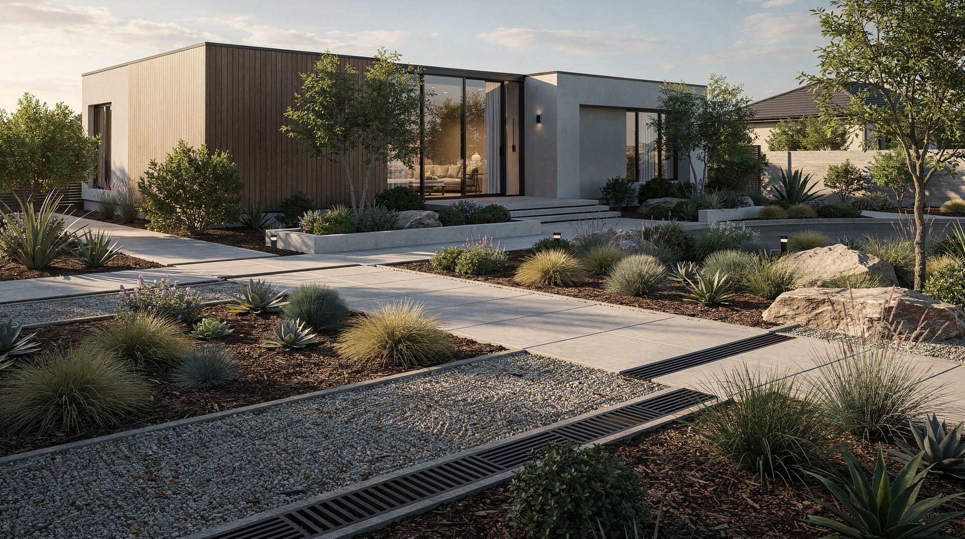
The palette Dutch homes are moving towards for 2026 is not one trendy shade. It’s a philosophy: Nature and Urban Fusion. For anyone in the Netherlands planning a renovation, especially in the compact homes characteristic of Amsterdam, Rotterdam, or Utrecht, understanding this trend is the key to creating a space that is not only beautiful but liveable.
Decoding the Dutch Design Language: Key Concepts
The Dutch approach to home design is famously pragmatic, innovative, and shaped by the environment.
- “Hygge” Meets “Gezelligheid”: While the Danish have ‘hygge’, the Dutch have ‘gezelligheid‘–cosiness, conviviality, and a warm, welcoming atmosphere. Any successful Dutch renovation, no matter how modern, has to end up feeling that way.
- Bouwvergunning (Building Permit): This is your non-negotiable first step for most structural changes. The rules are strict, especially in historic city centres and for extensions. Engaging a professional early to navigate this process is essential; they know how to design within the regulations to get your plans approved.
- Energy Label and Sustainability: Dutch building codes are increasingly focused on energy efficiency. A renovation is a prime opportunity to improve your home’s Energy Label. Using sustainable materials and high-performance insulation isn’t just good for the planet–it’s a smart financial investment, and it fits the “nature” side of the fusion trend.
The 2026 Palette: More Than Just Paint
The Nature and Urban Fusion trend is a layered color scheme. Forget flat, single-color walls.
The Nature Foundation
These colors bring the outside in, providing calm and grounding.
- Moss-Drenched Stone: A complex, grey-green shade that feels both organic and timeless. It’s the perfect neutral for living rooms or bedrooms, replacing colder greys.
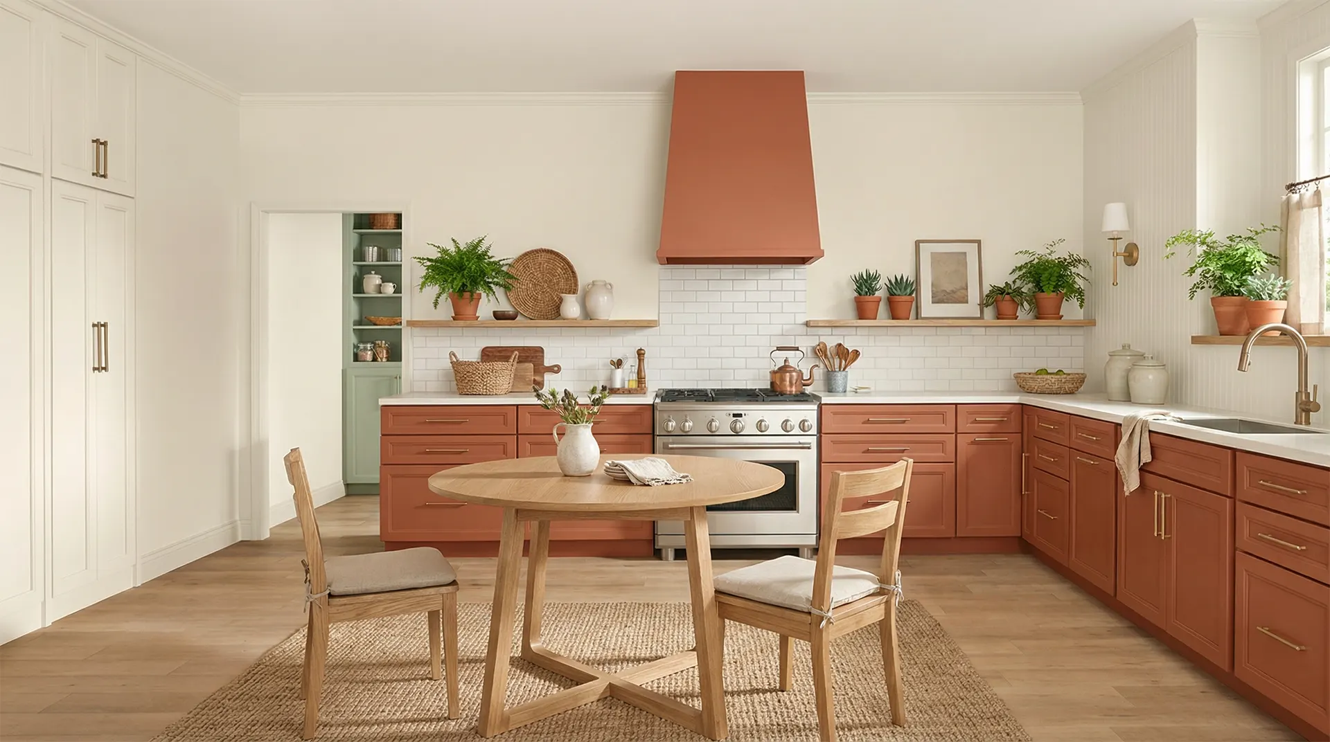
- Deep Clay and Terracotta: Warmer than a standard brown, these hues echo the Dutch earth and add palpable warmth and texture to a space.
- Sun-Bleached Linen: A soft, airy off-white with a subtle yellow or grey undertone. It reflects light beautifully, crucial for darker Dutch homes, and evokes natural, unbleached fabrics.
The Urban Accent
These shades inject energy, sophistication, and a contemporary edge.
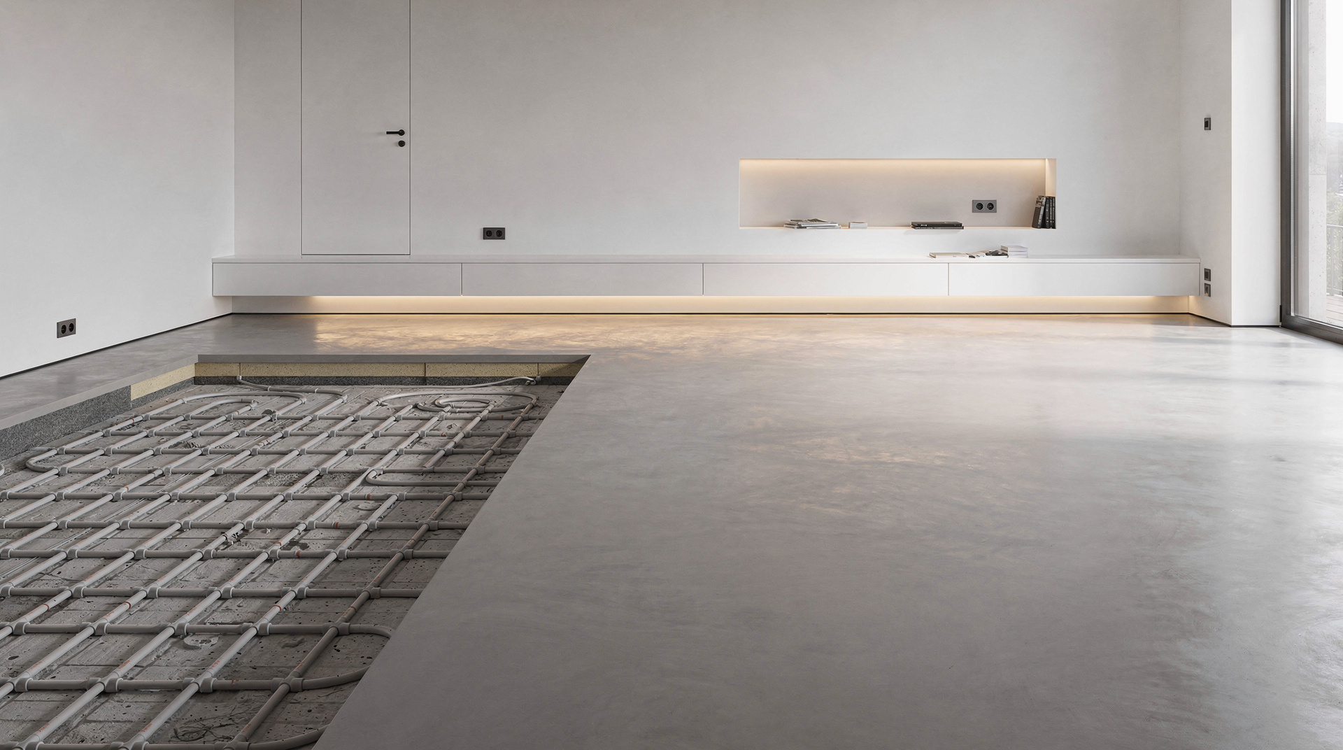
- Concrete Graphite: A deep, soft black with a matte finish, reminiscent of polished concrete or wet city streets at night. Used sparingly on feature walls, kitchen cabinetry, or door frames, it adds definition.
- Metallic Slate: A blue-grey with a subtle metallic sheen, reflecting the play of light on modern architectural glass and steel.
- Structural Red Oxide: A muted, earthy red that recalls the raw steel of bridges and industrial elements before painting. It’s a powerful, yet surprisingly warm, accent colour.
Space-Saving Ideas: Where Trend Meets Function in Dutch Homes
The 2026 color trend does most of its work here. Applying these colors isn’t just about decoration; it’s a strategic tool to manipulate perception and maximize limited square metres.
Color Strategies for Small Spaces
- Create a “Color Flow”. Use your dominant nature tone (like Moss-Drenched Stone) throughout connected spaces–hallway, living room, kitchen. This creates a sense of expansive continuity. Then, introduce urban accent colours in specific, defined zones.
- Define Zones Without Walls. In an open-plan apartment, use a bold Structural Red Oxide on a single kitchen wall or a Concrete Graphite on built-in shelving to visually separate the cooking area from the living space without blocking light or movement.
- Elevate the Ceiling. Painting a ceiling a shade lighter than the walls (Sun-Bleached Linen is ideal) makes it appear to recede, creating an illusion of height and airiness that counteracts the boxy feel of some older Dutch apartments.
Integrated Furniture and Smart Surfaces
The fusion trend rejects clutter. Furniture should be multi-functional and feel like part of the architecture.
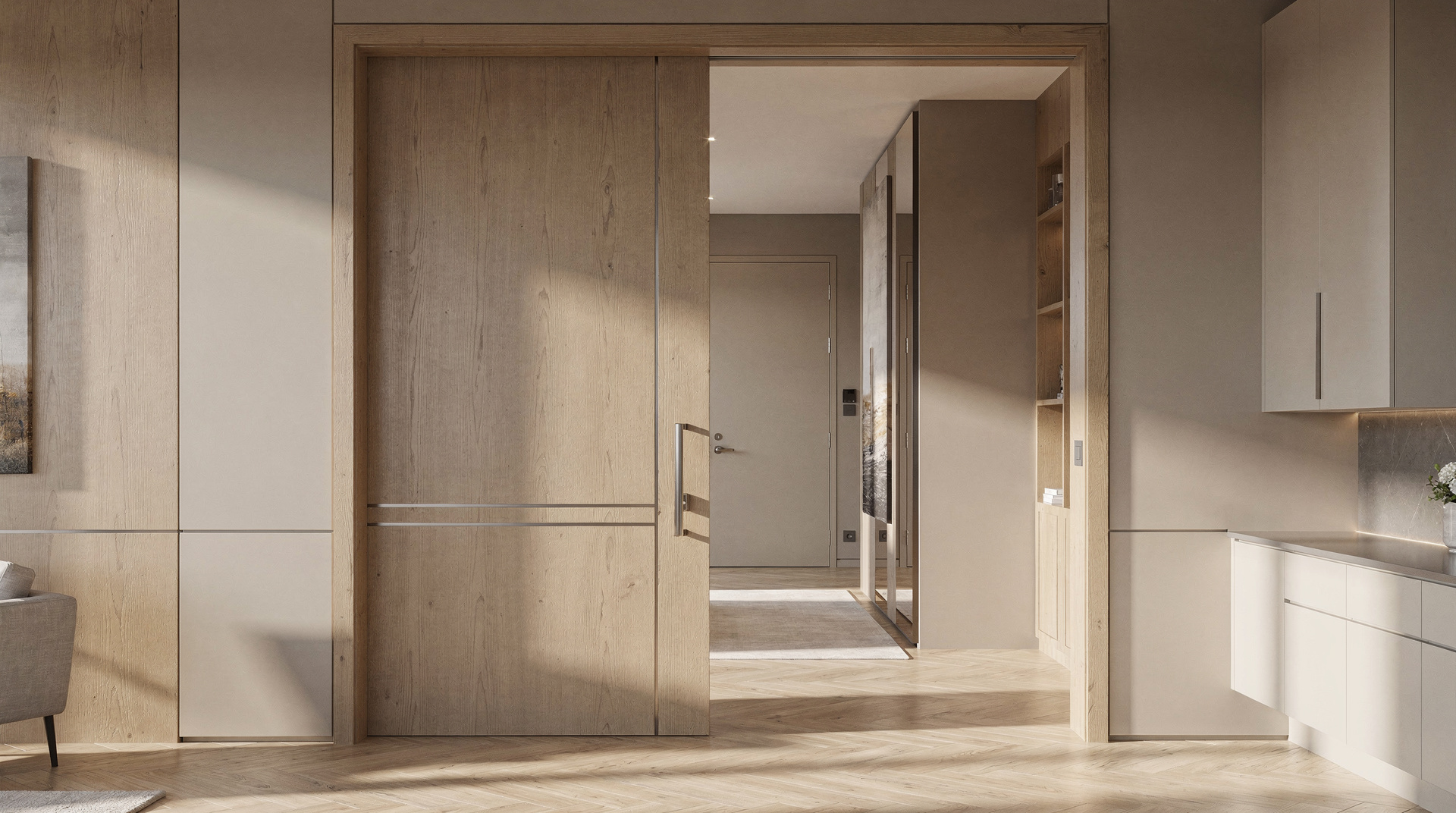
- Built-in is King. A bench with storage under the window, a bed with integrated drawers, floor-to-ceiling cupboards painted in the same colour as the walls–these elements disappear visually, reducing clutter and making the room feel larger.
- Material Mixology. Combine the colours with their physical counterparts. A wall in Deep Clay might be paired with real wood shelving. A Concrete Graphite kitchen island could be topped with a honed stone counter that picks up the Moss-Drenched Stone tones from the floor. This tactile layering is the essence of fusion.
Paint Samples, Materials and a Lighting Plan
Turning this into a finished room takes planning.
- Start with a Professional. Hire an architect or interior designer who understands both Dutch building regulations (bouwvergunning) and contemporary design. They can translate this colour and material philosophy into a buildable, permit-approved plan. This is not a DIY project.
- Test Your Palette in the Light. Dutch light is unique–often soft and grey. Paint large A3 samples of your chosen colours on several walls and observe them over 24 hours. That “perfect” green may look dull in your north-facing living room.
- Invest in Quality, Sustainable Materials. The fusion trend relies on authenticity. Choose real wood over laminate, natural stone over porcelain imitations, and high-quality matte paint. Prioritise materials with low VOC content and high recycled content to meet both aesthetic and sustainability goals.
- Lighting as Architecture. Your lighting plan should be designed in tandem with your colour scheme. Use warm, dimmable LEDs. Consider recessed lighting to keep lines clean, and use adjustable wall washers to highlight your textured, coloured walls–making the colour itself a focal point.
- Stick to “Less is More”. Edit ruthlessly. The fusion look becomes chaotic with too many objects. Choose a few bold, beautiful pieces that complement your colour story and let the space breathe.
Where to Start with a Fusion Renovation
The Dutch Colors of the Year 2026 signal a move towards mindful, intentional living. The Nature and Urban Fusion trend answers a very modern need: creating a home that is both a serene refuge from the city and a stylish, functional part of it. By using this sophisticated palette strategically, you can visually expand your space, improve its energy efficiency, and craft an environment that is gezellig. The renovations that work combine a clear idea with detailed local knowledge. Start with the right professional team, let this fusion of the organic and the engineered guide your choices, and build a home that feels uniquely, harmoniously Dutch.