The Psychology of Color: Choosing the Right Palette for Your Space
Color changes how a room feels to be in. Warm colors suit living rooms and kitchens, cool colors suit bedrooms and bathrooms, and the daylight a room gets decides how either will look on the wall. Here is how to pick a palette for a Dutch interior.
What Color Psychology Means for Your Home
Color psychology is the study of how colors affect human behavior and emotions. Different colors can evoke different emotions, influence mood, and even impact our physical well-being. In the context of home design, color psychology can be used to create spaces that promote relaxation, stimulate creativity, or even boost energy levels. In the Netherlands, where the climate can be quite gloomy, choosing the right colors can be especially important to create a warm and welcoming atmosphere.
Color Theory and Emotional Response
Colors can be broadly categorized into warm and cool colors, each evoking different emotional responses. Warm colors such as red, orange, and yellow tend to stimulate the senses, creating a cozy and inviting atmosphere. These colors are perfect for social areas like living rooms and kitchens, where you want to create a warm and welcoming ambiance. On the other hand, cool colors like blue, green, and purple have a calming effect, making them ideal for bedrooms and bathrooms, where relaxation is key. In Dutch interior design, it is common to see a mix of warm and cool colors used to create a balanced and harmonious palette.
Popular Color Schemes in the Netherlands
The color schemes that come up most often in Dutch interiors:
- Monochromatic: Using different shades of the same color to create a cohesive look.
- Complementary: Pairing colors that are opposite each other on the color wheel, such as blue and orange, to create a visually striking effect.
- Analogous: Using colors that are next to each other on the color wheel, such as blue, green, and yellow, to create a harmonious palette.
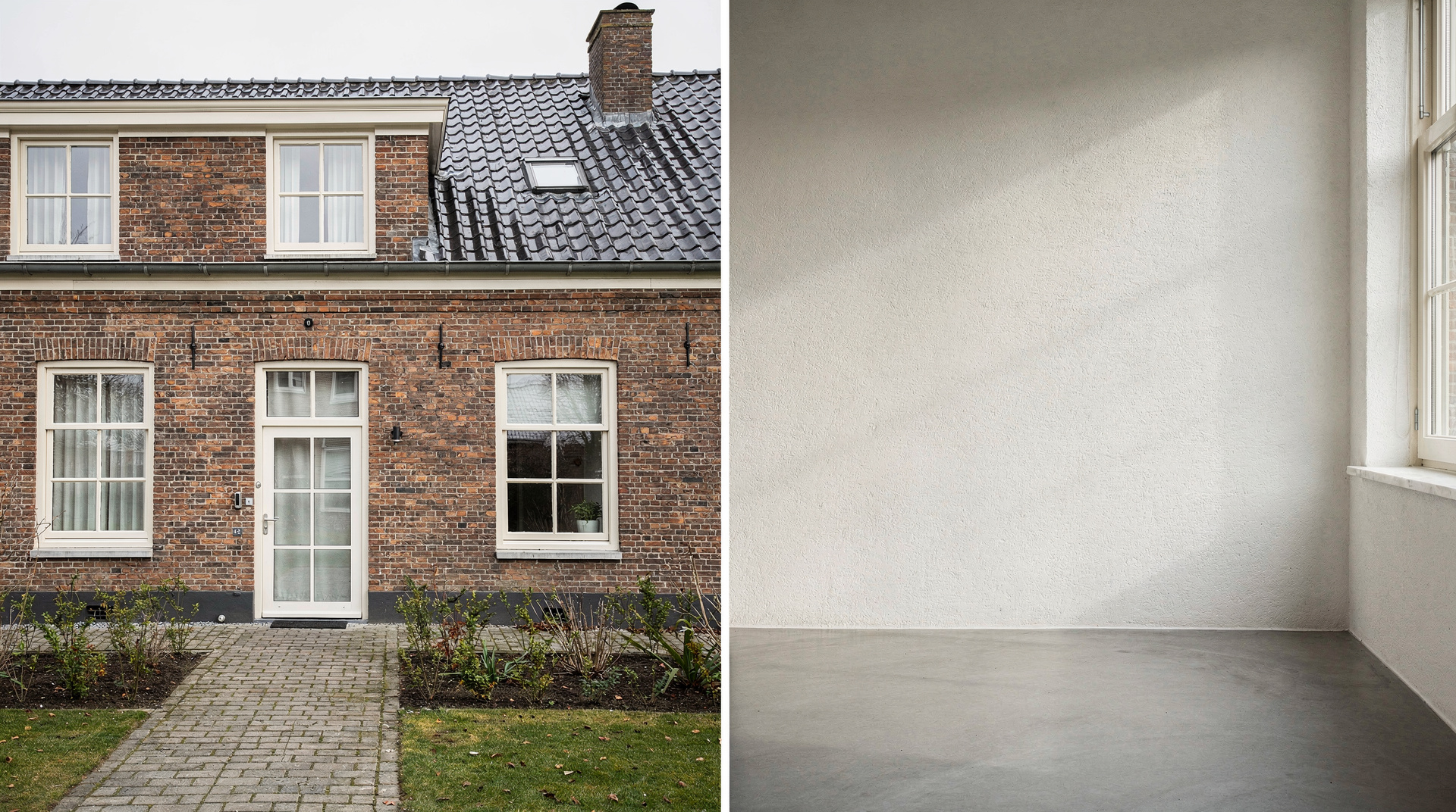
- Neutral: Using a combination of neutral colors like beige, gray, and white to create a calm and serene atmosphere.
Mood-Enhancing Colors in Dutch Homes
Certain colors are known to have a positive impact on our mood and well-being. In Dutch homes, it is common to see the use of mood-enhancing colors like:
- Yellow: Known to stimulate creativity and energy, yellow is a popular choice for home offices and study areas.
- Blue: Calming and soothing, blue is often used in bedrooms and bathrooms to promote relaxation.
- Green: Associated with nature and growth, green is a popular choice for living rooms and kitchens, where it can create a sense of balance and harmony.
Natural Light, Room Purpose and Paint Samples
When choosing a color palette for your Dutch home, there are several factors to consider. Here are some practical tips to keep in mind:
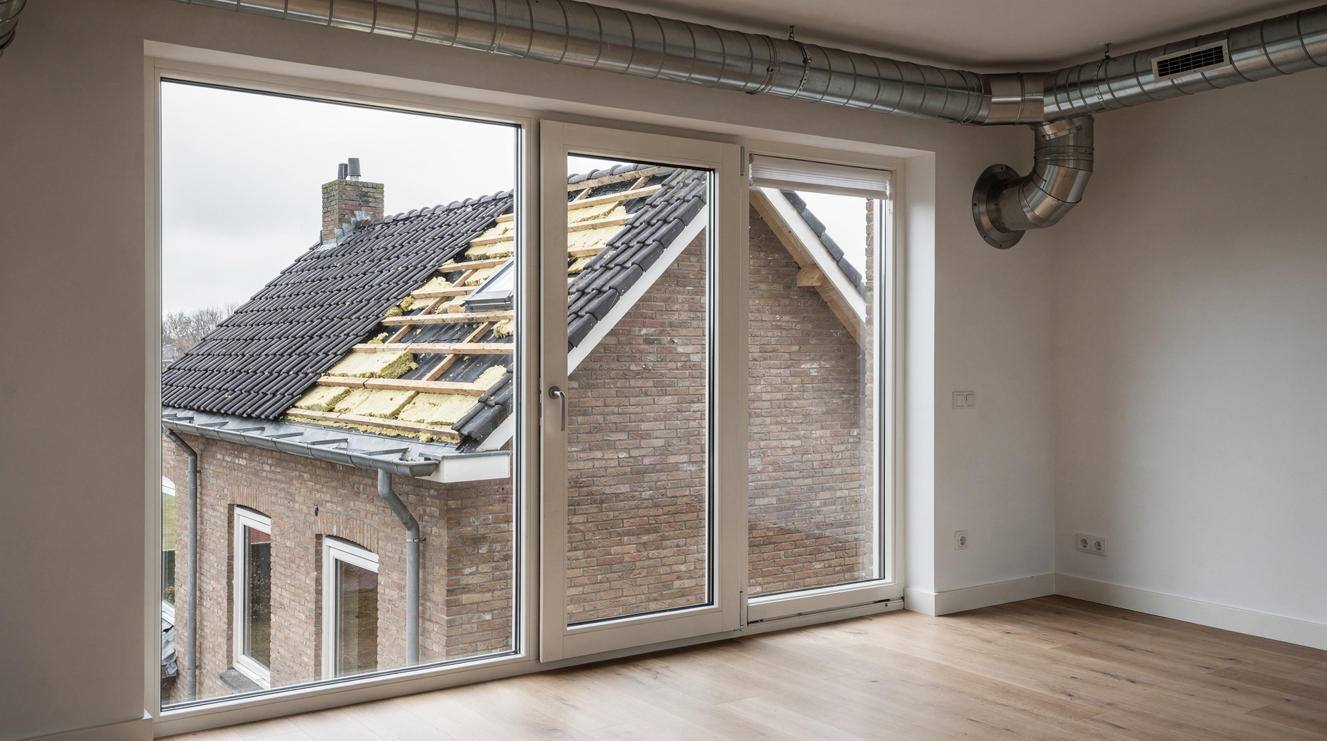
- Consider the natural light: The amount of natural light your home receives can greatly impact the way colors appear. Choose colors that will look good in both bright and low light conditions.
- Think about the room’s purpose: Different rooms have different functions, and the color scheme should reflect that. For example, a bedroom should be calming, while a home office should be stimulating.
- Don’t forget about neutrals: Neutral colors like beige, gray, and white can provide a clean and versatile backdrop for your color scheme.
- Test the colors: Before committing to a specific color scheme, test the colors with a paint sample or by using online visualizers.
Test the Colors on the Wall First
The palette you choose changes how the house feels to live in. Weigh the natural light, the purpose of each room and where neutrals can carry the scheme, then test the colors on a wall before you commit to them.